AEROFLY
AEROFLY
AEROFLY
AEROFLY
2021, 2025
2021, 2025
2021, 2025
2021, 2025
LOGO & IDENTITY DESIGN
LOGO & IDENTITY DESIGN
LOGO & IDENTITY DESIGN
LOGO & IDENTITY DESIGN
LOGO & IDENTITY DESIGN
BRAND GUIDELINES
BRAND GUIDELINES
BRAND GUIDELINES
BRAND GUIDELINES
BRAND GUIDELINES
ILLUSTRATIONS
ILLUSTRATIONS
ILLUSTRATIONS
ILLUSTRATIONS
ILLUSTRATIONS

A successful brand identity starts with understanding. I took a deep look into the travel industry, uncovering opportunities for Aerofly to stand apart. This research shaped a clear strategy, one that balances innovation with reliability.
At the core of the identity is an abstract mark inspired by the letter
"A,' symbolizing motion and direction. Alongside it, a dynamic graphic motif, a distinctive illustration system, a refined color palette, clean and modern typography, custom icons, and campaign messaging work together to build a cohesive brand.
These elements form a strong and recognizable visual language, ensuring Aerofly stands out in a competitive market.
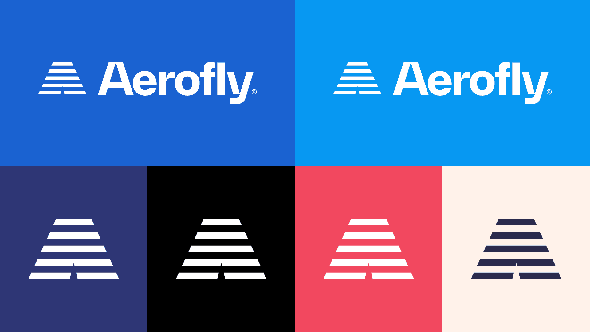


Aerofly was one of my first brand identity projects when I started as a Brand Designer. I created the original identity in 2021, and since then, my skills have evolved.
To reflect that growth, I decided to refresh the identity while keeping the core graphic elements. The main changes include a redesigned logo and the addition of a secondary color palette to improve its application and make the design more versatile.

NEXT PROJECT
NEXT PROJECT
NEXT PROJECT
NEXT PROJECT
G.L.T
G.L.T
AKINBINU
AKINTAYO
AKINBINU
AKINTAYO