LNU
LNU
LNU
LNU
2021
2021
2021
LOGO & IDENTITY DESIGN
LOGO & IDENTITY DESIGN
LOGO & IDENTITY DESIGN
LOGO & IDENTITY DESIGN
LOGO & IDENTITY DESIGN
BRAND GUIDELINES
BRAND GUIDELINES
BRAND GUIDELINES
BRAND GUIDELINES
BRAND GUIDELINES
ICON DESIGN
ICON DESIGN
ICON DESIGN
ICON DESIGN
ICON DESIGN

Solution
A research and strategy phase unlocked a strong identity system, tone of voice and advertising campaign that reorientates the university vision and reflects the strength and excellence.
For the visual identity components, the logo was refined to be responsive across a variety of circumstances, platforms and materials. I simplified the existing color palette giving the new identity a more established feel.
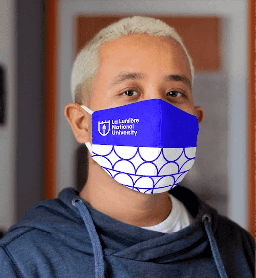
The new identity provides a timeless yet modern look that express the goals and vision of the company. The shield implies tradition, strength, security and reliability, the flaming torch signifies enlightenment and hope.
I introduced variations, alternate marks and athletics that the school can own for years to come.
The brand refresh modernises the university’s visual identity, introducing new seal and logo variations, visual elements, layouts and photography styles that the school can own for years to come.
Solution
A research and strategy phase unlocked a strong identity system, tone of voice and advertising campaign that reorientates the university vision and reflects the strength and excellence.
For the visual identity components, the logo was refined to be responsive across a variety of circumstances, platforms and materials. I simplified the existing color palette giving the new identity a more established feel.
The new identity provides a timeless yet modern look that express the goals and vision of the company. The shield implies tradition, strength, security and reliability, the flaming torch signifies enlightenment and hope.
I introduced variations, alternate marks and athletics that the school can own for years to come.
The brand refresh modernises the university’s visual identity, introducing new seal and logo variations, visual elements, layouts and photography styles that the school can own for years to come.


NEXT PROJECT
NEXT PROJECT
NEXT PROJECT
NEXT PROJECT
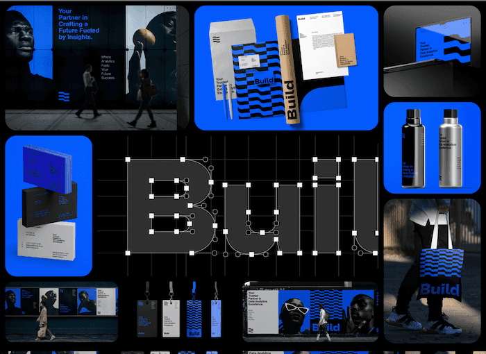
BUILD
BUILD
AKINBINU
AKINTAYO
AKINBINU
AKINTAYO